Caprisun
Caprisun: Refreshing a Global Icon for a New Generation
Project Included: Design Strategy, Packaging Design, Portfolio Design Strategy, Art Direction, Illustration Design, Colour Strategy
The Brief
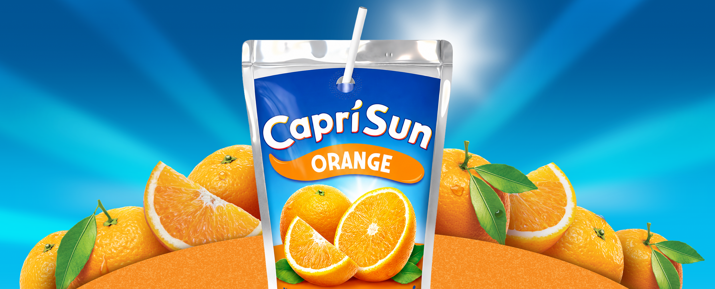
In 2025, Capri-Sun initiated a global brand refresh and packaging redesign across all international markets. The objective was to modernise the brand while preserving its iconic recognition and emotional appeal. Over time, the identity had become fragmented across markets, with inconsistent packaging systems, dated visual execution and poor navigation across an increasingly complex portfolio. The redesign needed to create a more contemporary, systemised and digitally ready brand world, while bringing a stronger sense of fun and flavour expression back to the centre of the Capri-Sun experience.
The Challenge
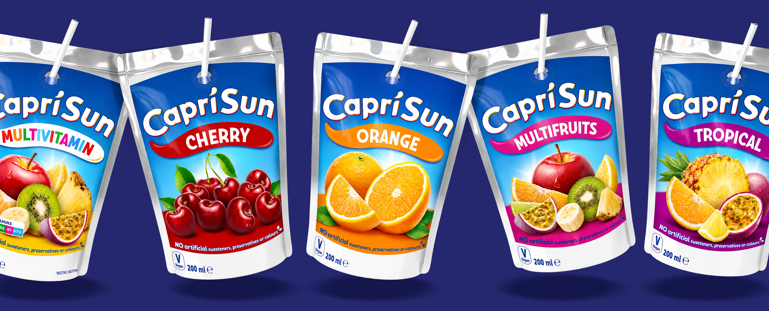
While Capri-Sun remained globally recognisable, the brand lacked a consistent and contemporary expression of fun despite this being central to its proposition of creating five billion smiles every year. Existing packaging systems varied significantly across markets and struggled to communicate flavour in a clear, vibrant and emotionally engaging way. The identity also required technical refinement, with the existing logo system needing to perform more effectively across digital environments, animation and modern communication platforms while retaining strong brand recognition.


The Solution
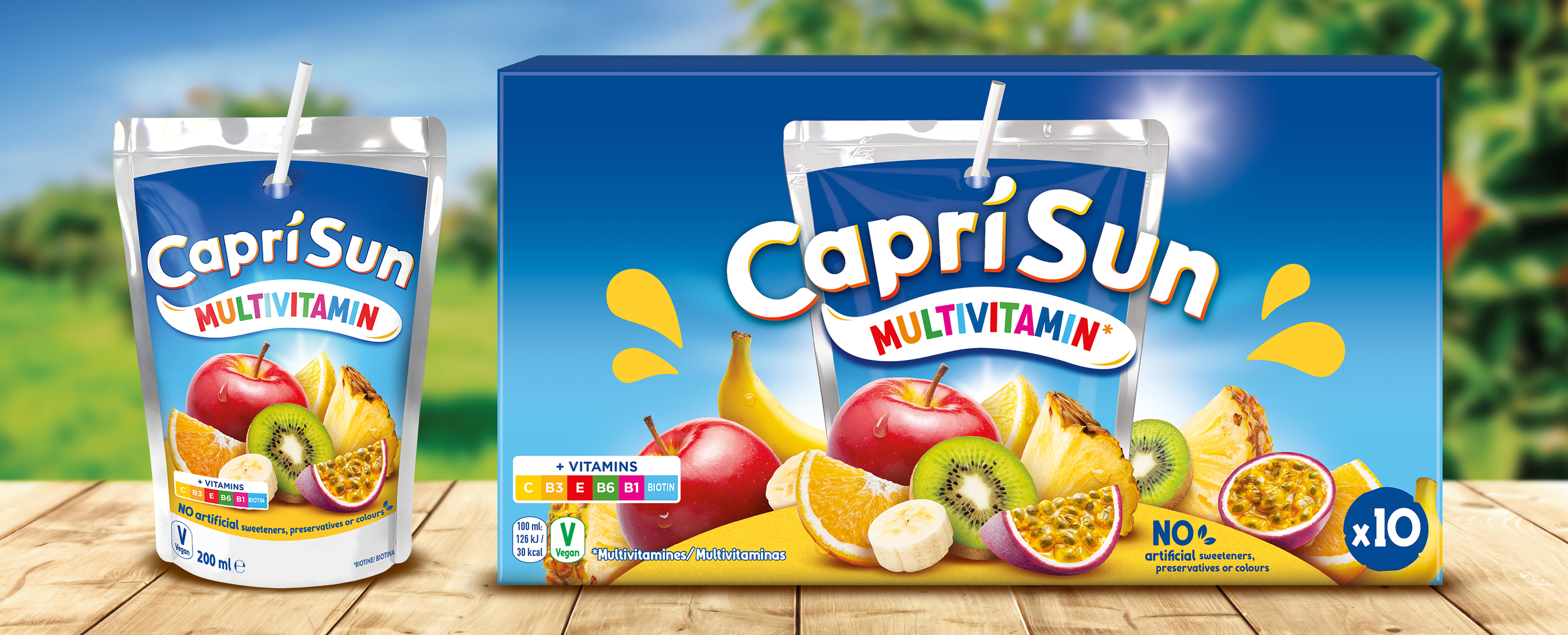
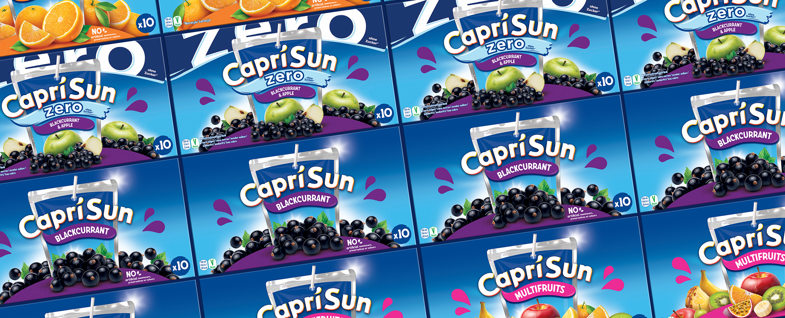
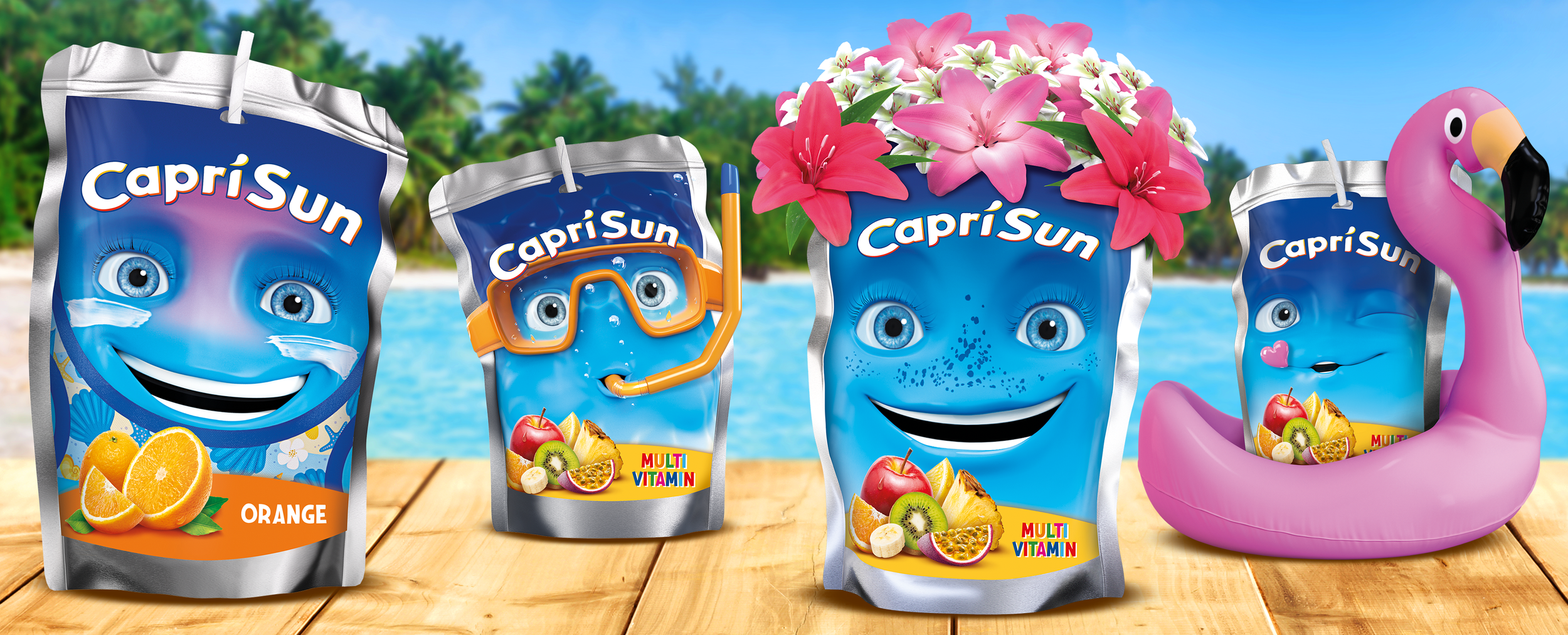
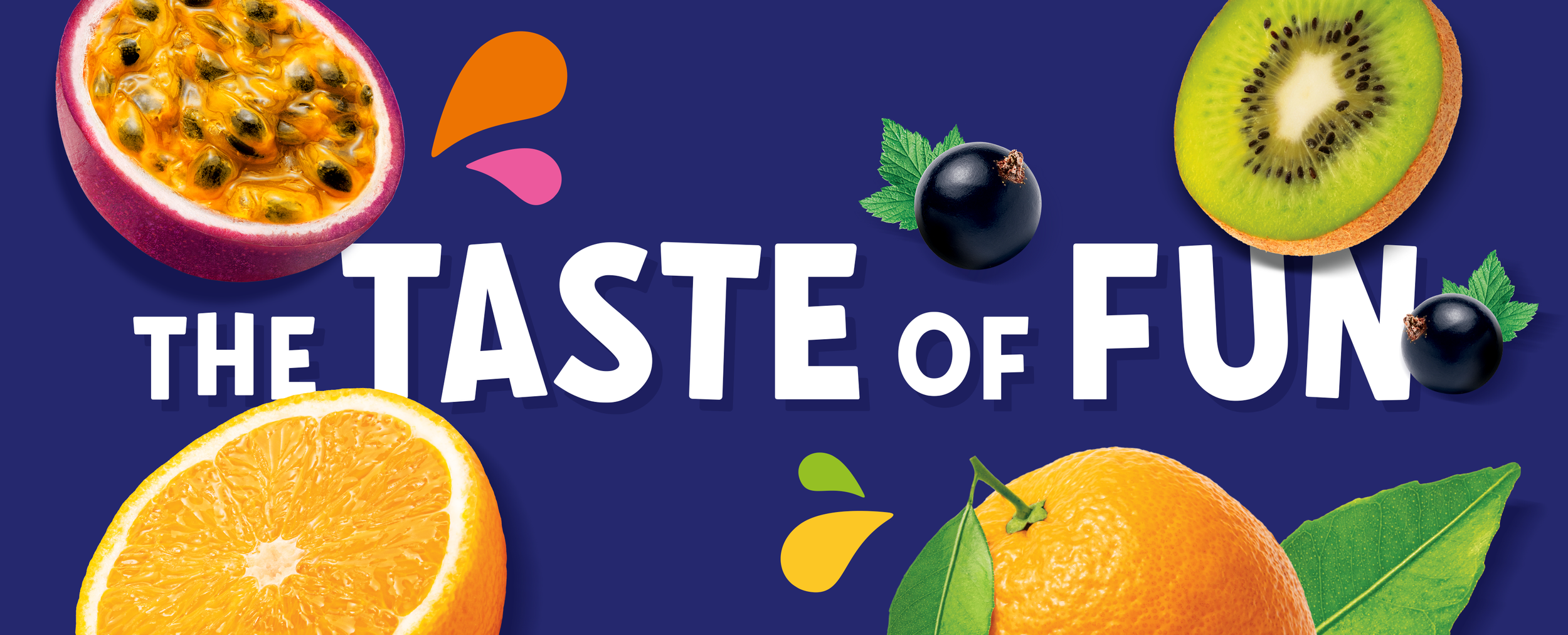
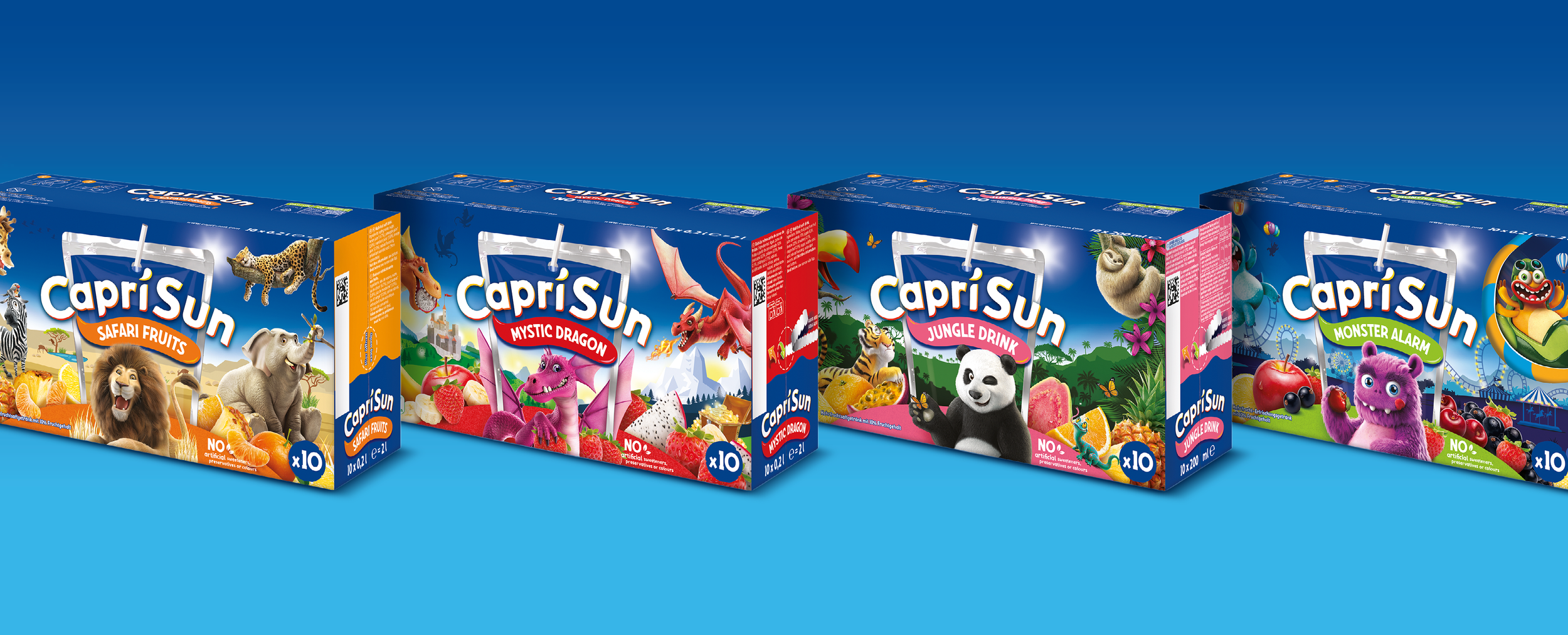
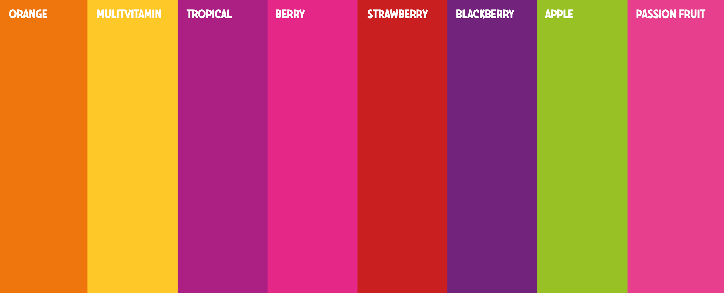
We evolved the Capri-Sun identity into a more modern and expressive global system centred around flavour, optimism and playfulness. The refreshed logo was refined for stronger digital performance and improved flexibility across packaging, motion and communication channels. A new global packaging architecture introduced a more coherent and scalable design system, with enhanced flavour communication, more contemporary fruit execution and a brighter, more energetic visual world. The result was a globally unified identity system designed to bring greater consistency, recognisability and fun to the brand across all markets.