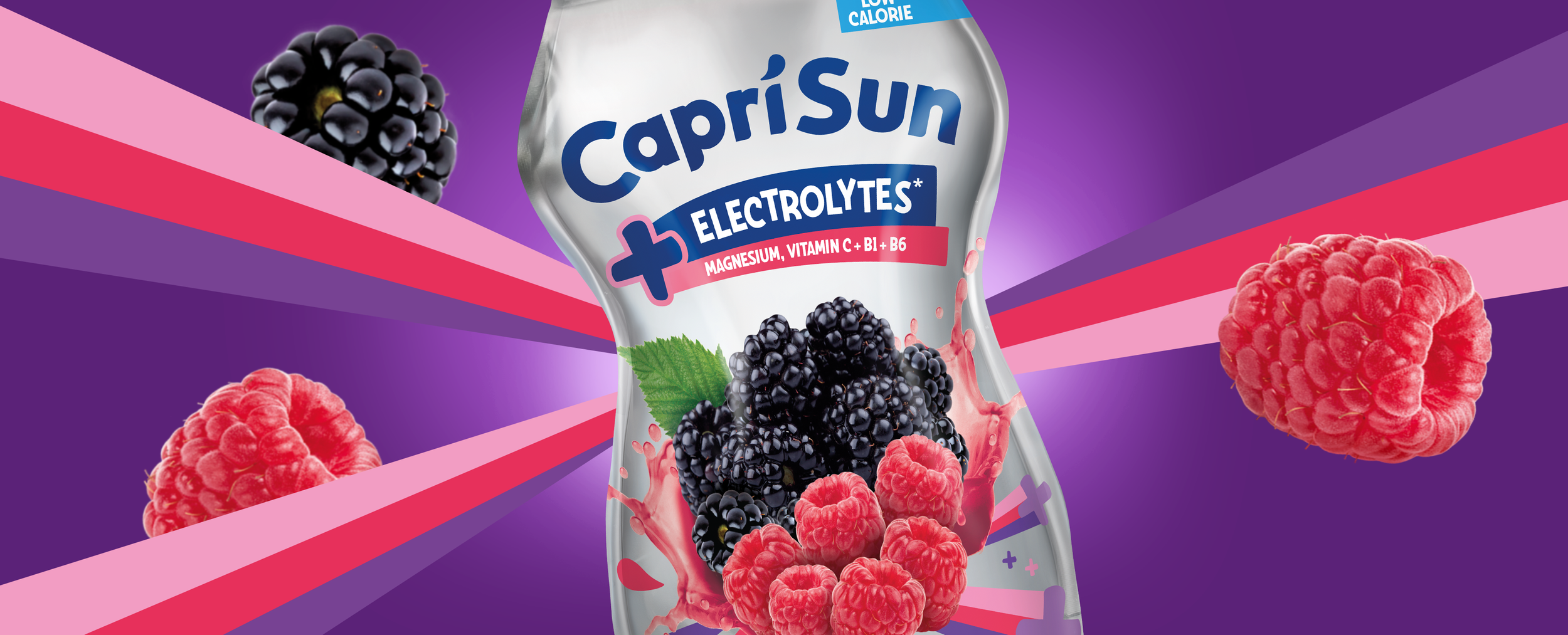
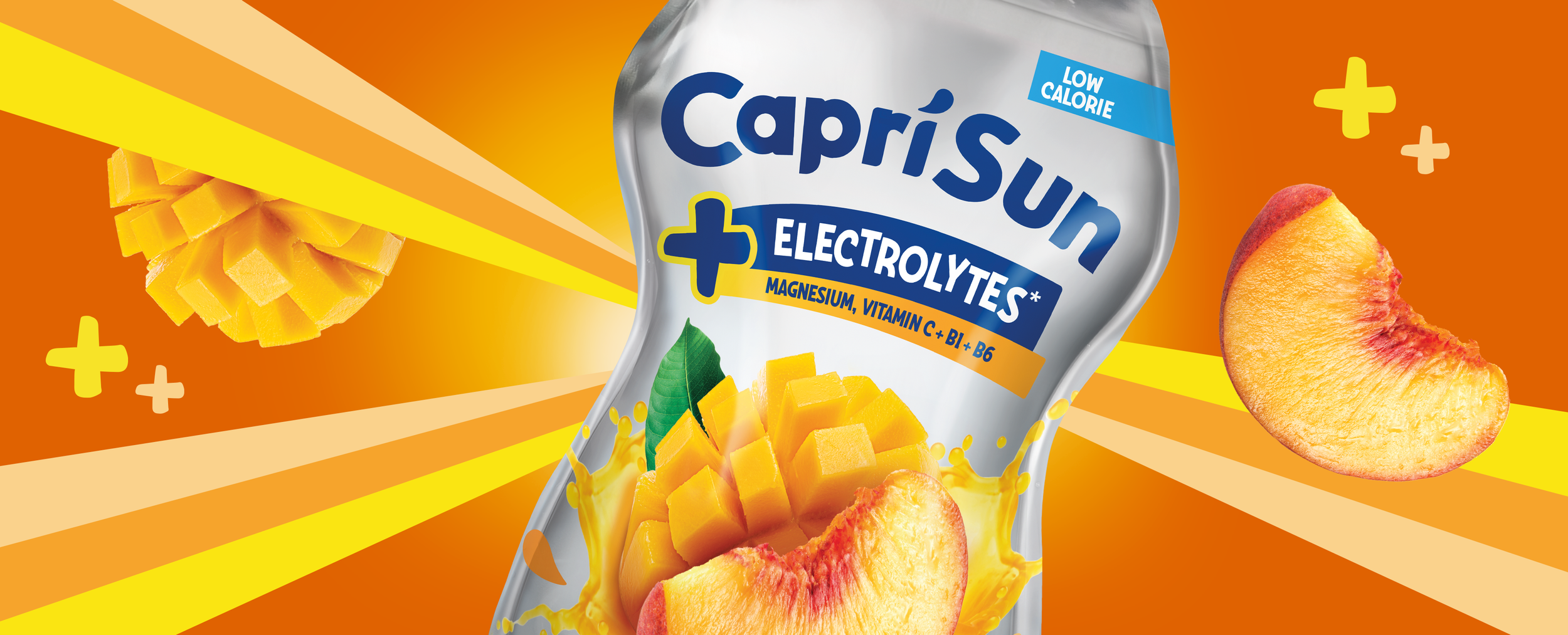
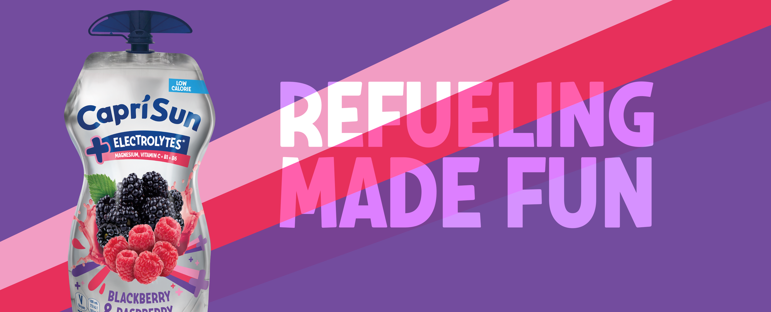
Capri-Sun + Electrolytes
Capri-Sun: Elevating Capri-Sun into Functional Hydration
Project Included: Design Strategy, Packaging Design, Art Direction, Illustration Design

The Brief
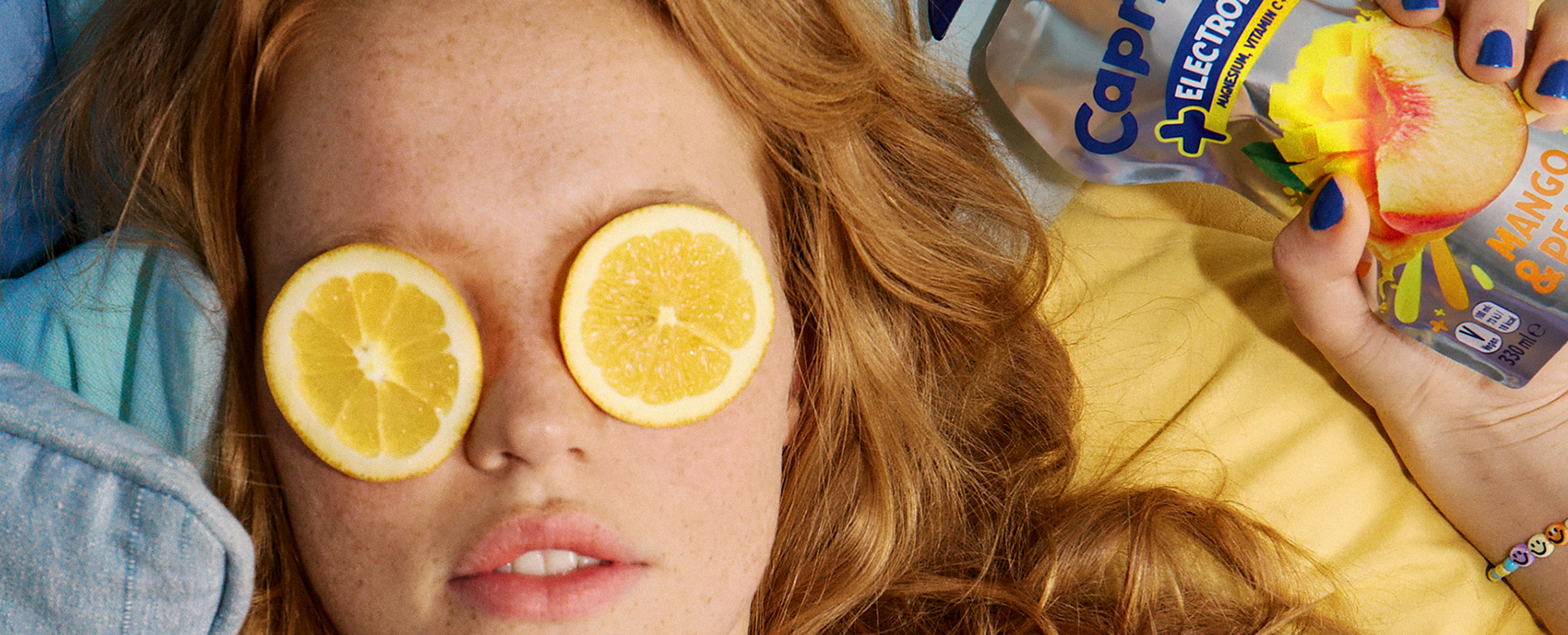
Capri-Sun set out to expand into the functional drinks space with a new electrolytes range, designed to support hydration and everyday energy. The challenge was to introduce this more performance-led proposition while remaining recognisably Capri-Sun. The product needed to appeal to a slightly older, more active audience, without losing the brand’s core sense of approachability and fun. At the same time, the benefits of electrolytes, vitamins, and low-calorie positioning needed to be communicated clearly and quickly.
The Challenge
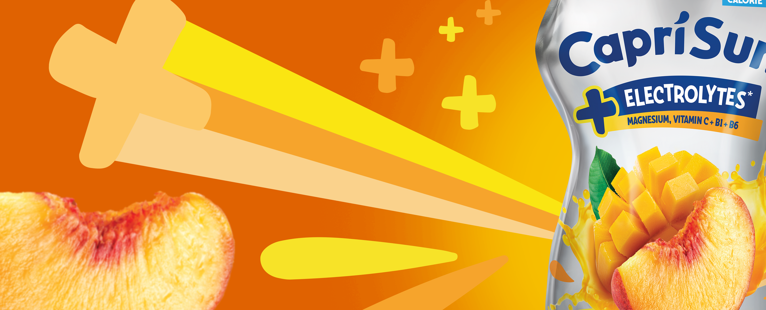
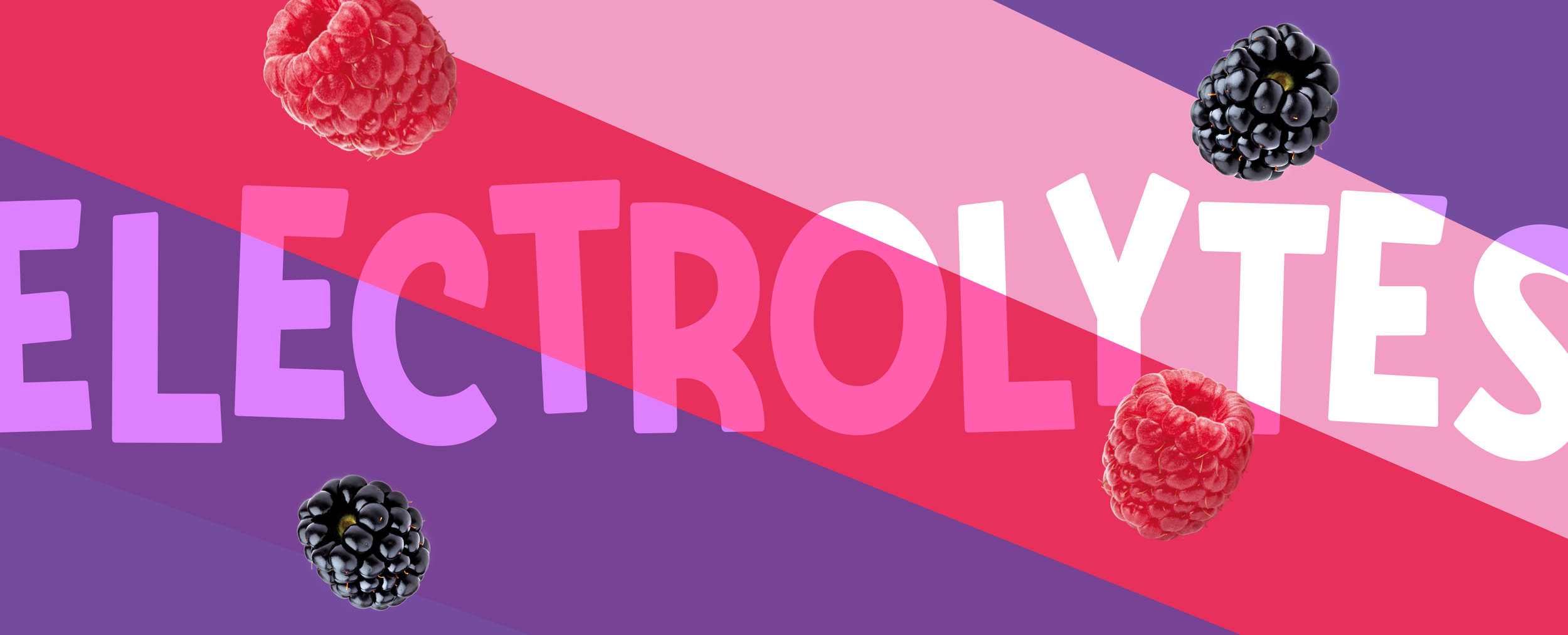
The core challenge was balancing two distinct territories: functional credibility and brand familiarity. Electrolyte drinks typically lean into serious, technical visual codes, while Capri-Sun is known for its playful, expressive identity. Moving too far in either direction risked either losing trust in the product’s efficacy or diluting brand recognition. There was also a need to introduce a clearer hierarchy of information, ensuring that key benefits such as magnesium and vitamins could be understood at a glance, without overwhelming the pack.

The Solution
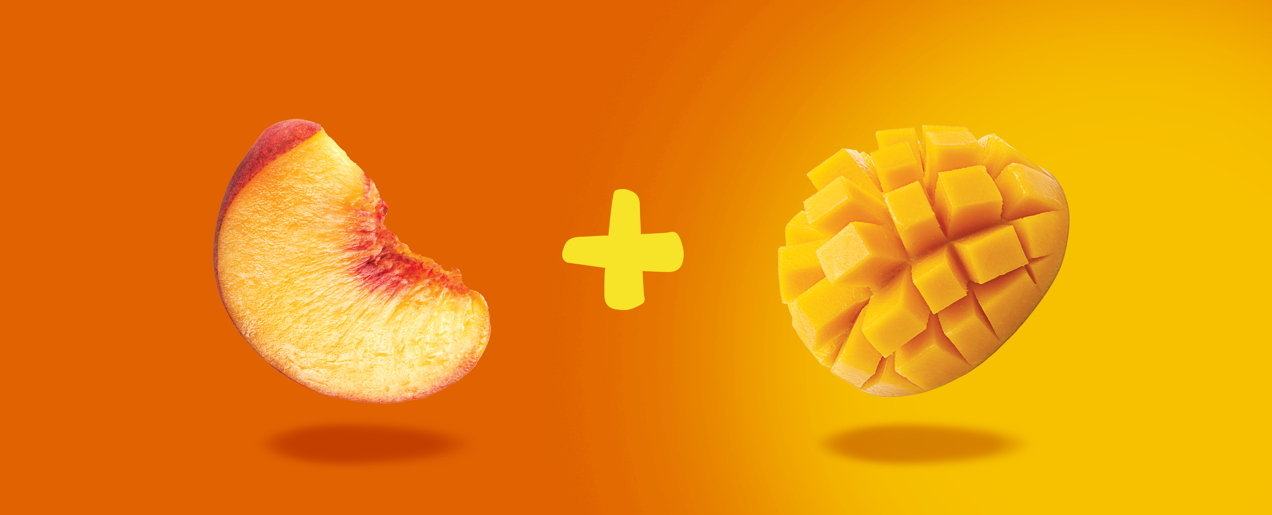
A more structured layout introduces clarity and confidence, with a bold “Electrolytes” panel and clear benefit callouts to establish functional credibility. The Capri-Sun logo remains central to maintain familiarity, while vibrant fruit visuals and energetic graphic elements bring back the brand’s sense of freshness and optimism. The result is a design that clearly communicates function while staying true to the Capri-Sun brand.