Sparkle
Sparkle: Reimagining a Household Staple Through Emotional Branding
Project Included: Design Strategy, Packaging Design, Art Direction, Illustration Design

The Brief
Georgia-Pacific approached us to reposition Sparkle from a highly functional household paper brand into a more emotionally engaging and distinctive consumer proposition. The objective was to modernise the brand, improve shelf presence and create a stronger emotional connection with consumers in a highly commoditised category.
The Challenge
The household paper category is traditionally dominated by rational messaging focused on strength, absorbency and value. Existing branding relied heavily on literal cleaning imagery and lacked the emotional storytelling needed to build long-term brand affinity. The challenge was to move Sparkle beyond functional communication and create a more memorable and ownable brand world that could emotionally connect with house proud consumers while remaining commercially impactful at shelf level.
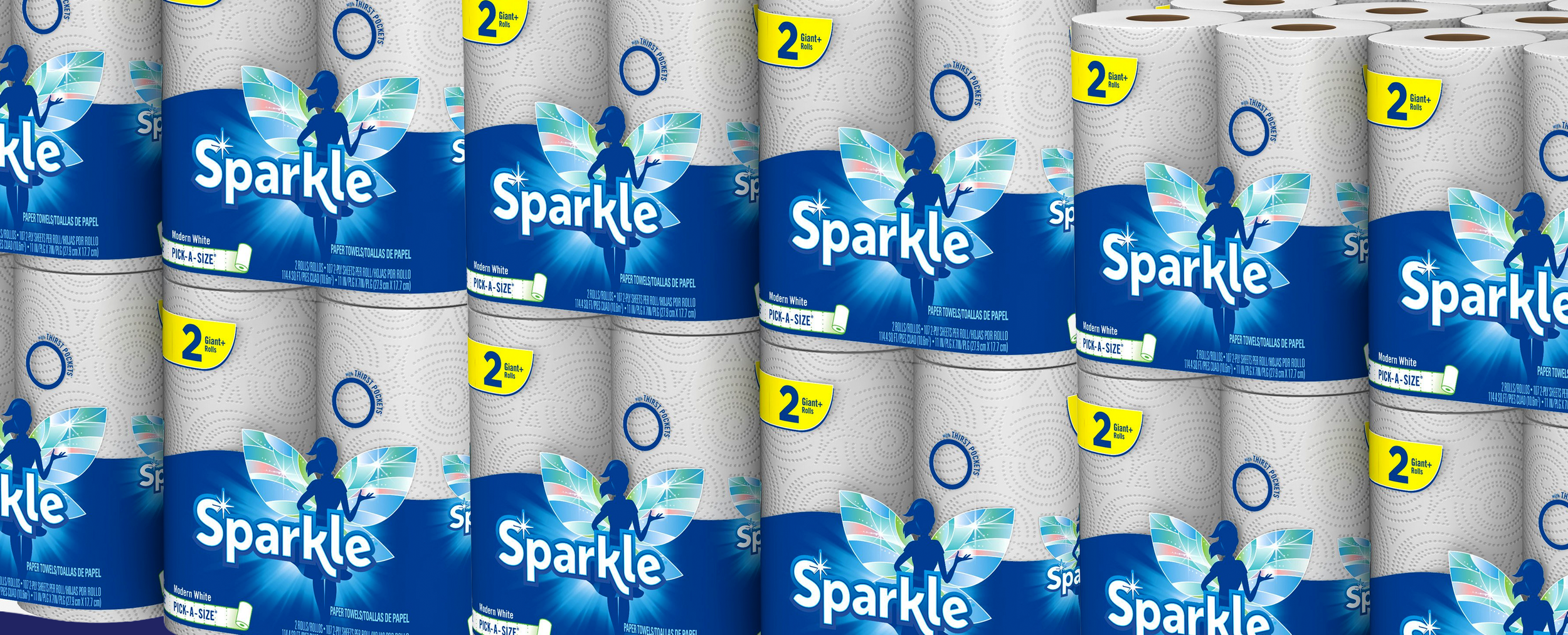
The Solution
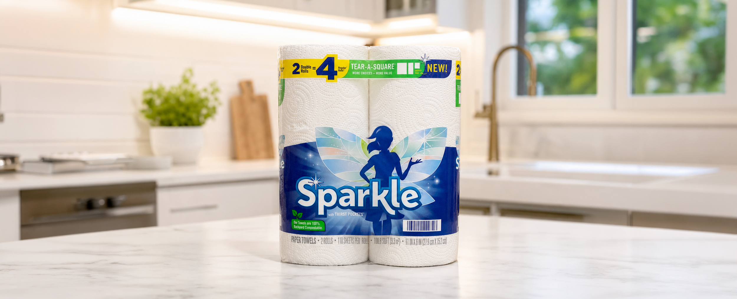
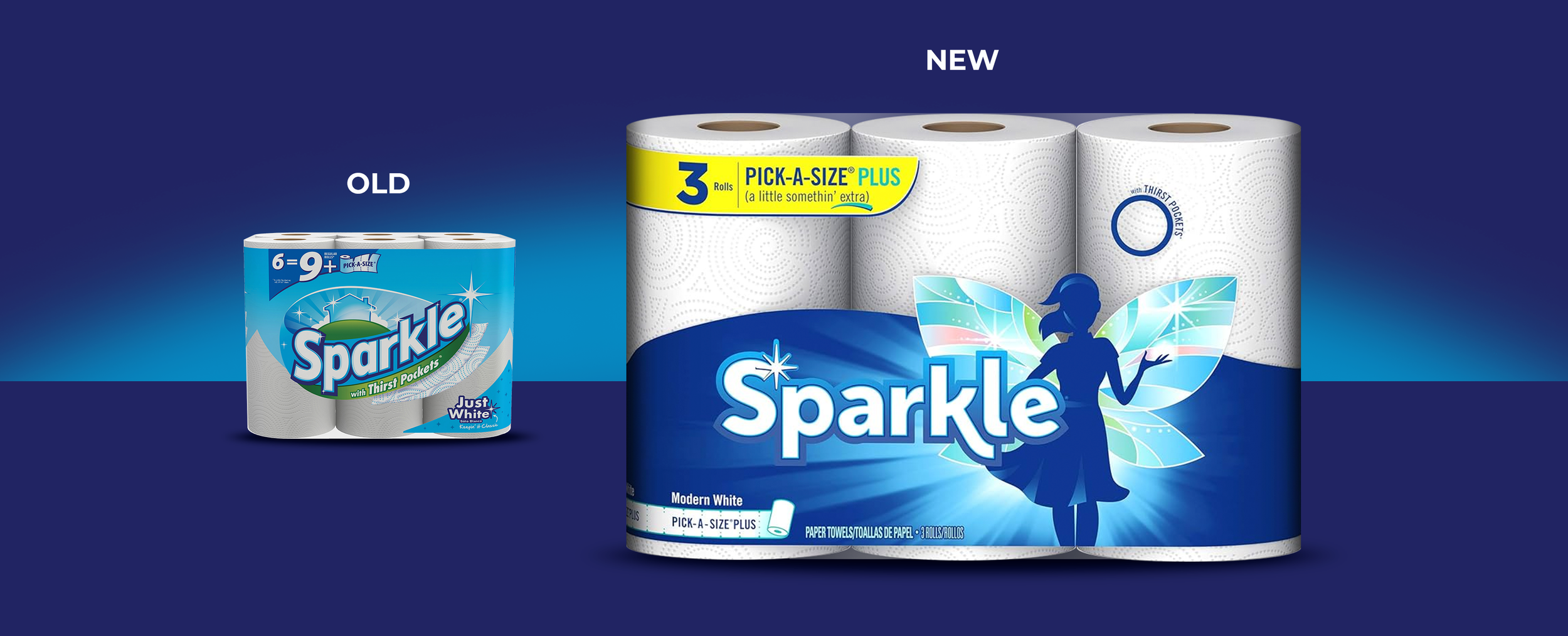
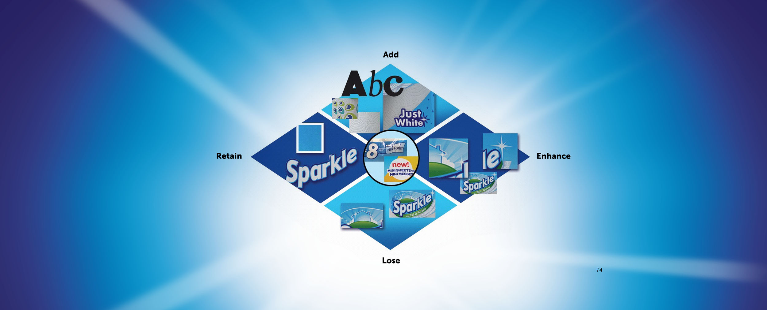
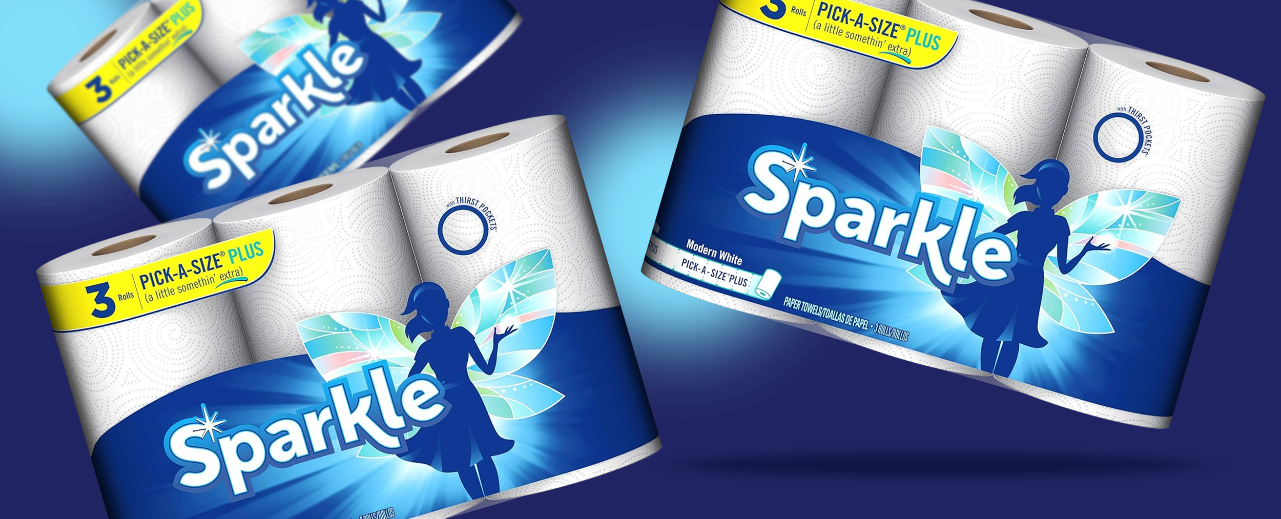
We repositioned Sparkle around a more uplifting and expressive visual identity centred on the introduction of the Sparkle fairy character and her illuminated wings. The redesign transformed the brand from a purely functional product into a more emotional and optimistic household companion. Using strategic brand evaluation tools, we refined key equities while modernising the identity system, packaging architecture and shelf communication. The result was a highly recognisable and emotionally driven brand world that helped deliver significant commercial growth, including a reported 300% increase in market performance.